Movie Snack App was designed for users to conveniently order movie snacks online, allowing them to save time.
Movie Snack App was the first project out of 3 for Google Design Certificate. I had to take on a role as a UX designer and UX researcher.
The responsibilities were:
*conducting interviews
*paper and digital wireframing
*low and high-fidelity prototyping
*conducting usability studies
*accounting for accessibility
*iterating on designs
Problem
Movie theater customers needed an alternative way buying their snacks to avoid the wait in line, or simply combining their ticket purchase with the snack.
Solution
Create a Snack App that allows users to pre-order their snacks when they reserve their movie ticket.
Tools
Figma
Team
UX designer
My Role
UX Designer
UX Researcher
Timeline
Overall: 12 weeks
Discovery & Research: 3+ weeks
Design & testing: 2 weeks
My Design Process
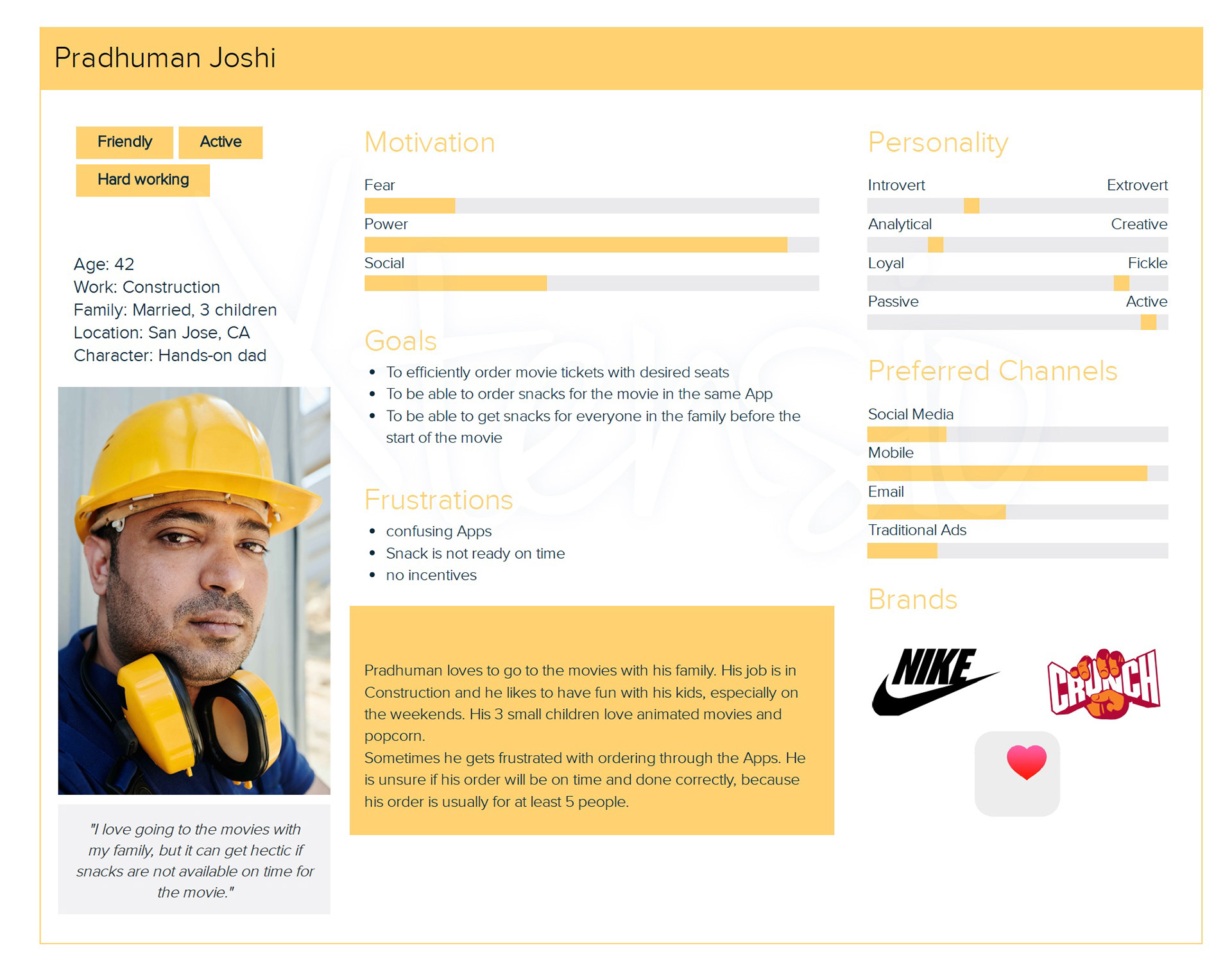
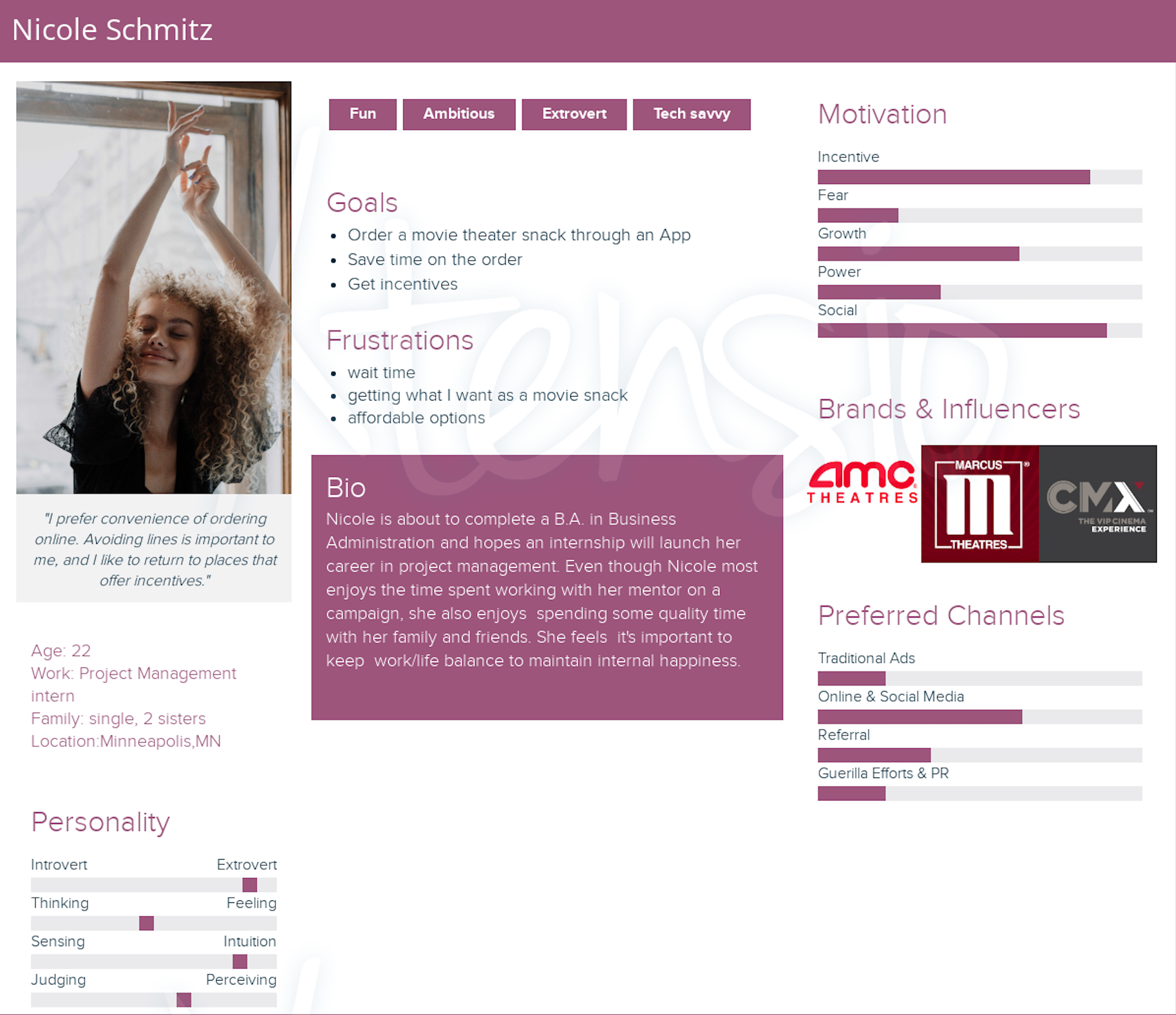
Personas
I wanted to form a deeper understanding of our users' goals, needs, experiences, and behaviors. So, I created 2 personas for each of user segments. They were based on user interviews and surveys.
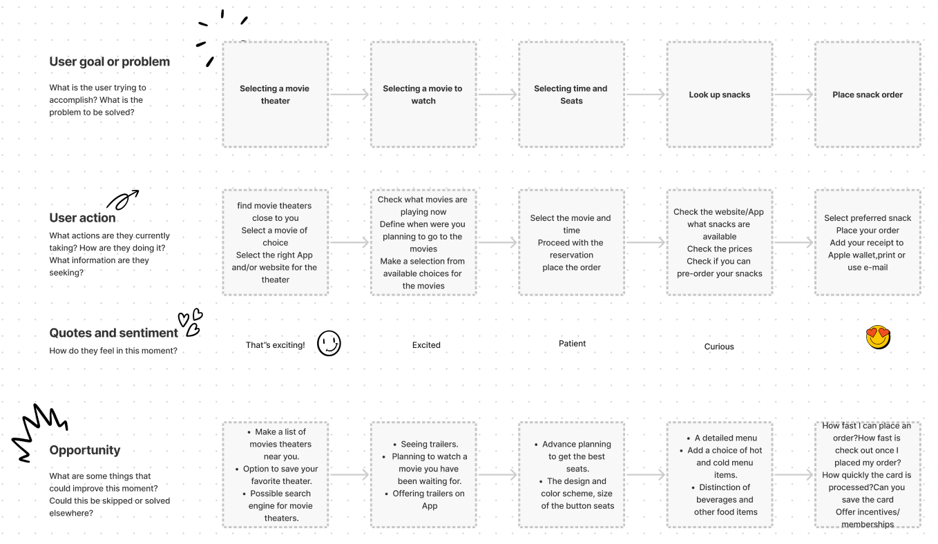
User Journey
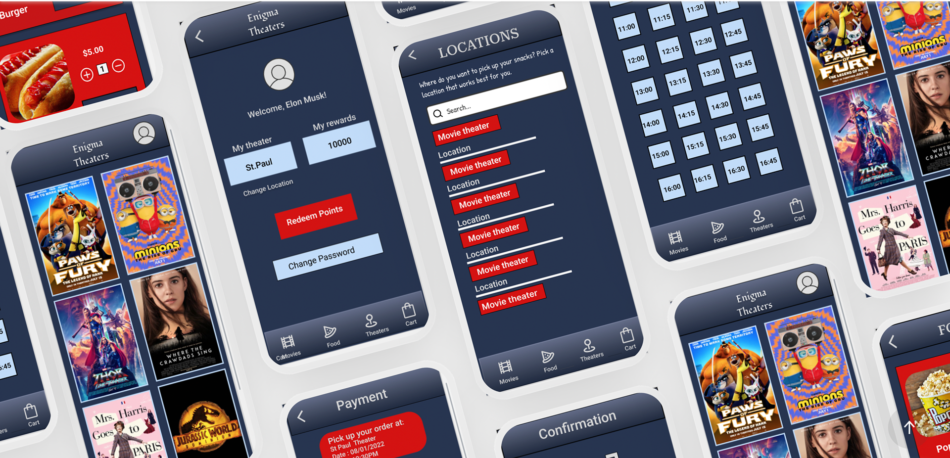
With the user accessibility in mind, I wanted to make sure that users reach the checkout screen without any hiccups. So, I created this user journey map, to identify opportunities for improvement. I was able to identify that a user needs to select the right location for the movie theater, so it could connect the user to the right selection of snacks available at this particular location, as well as specify the time it should be ready for user to pick up.
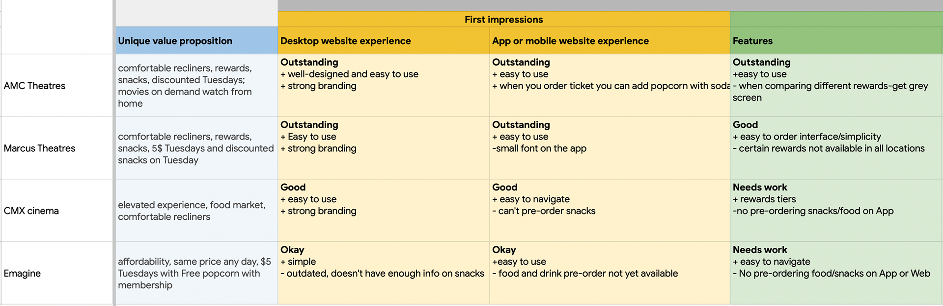
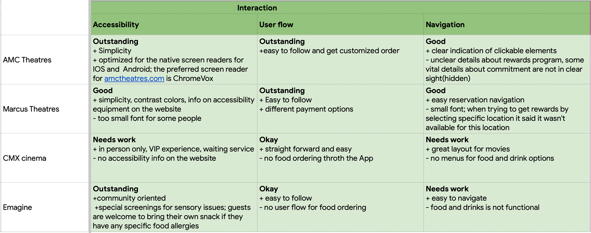
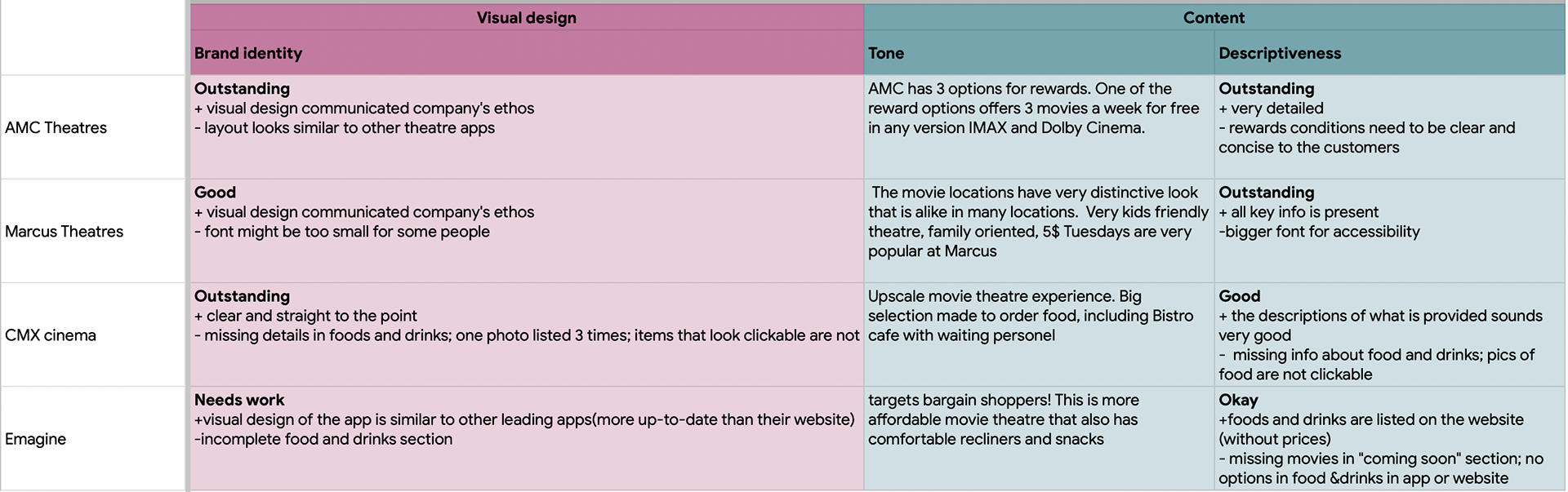
Competitive Audit
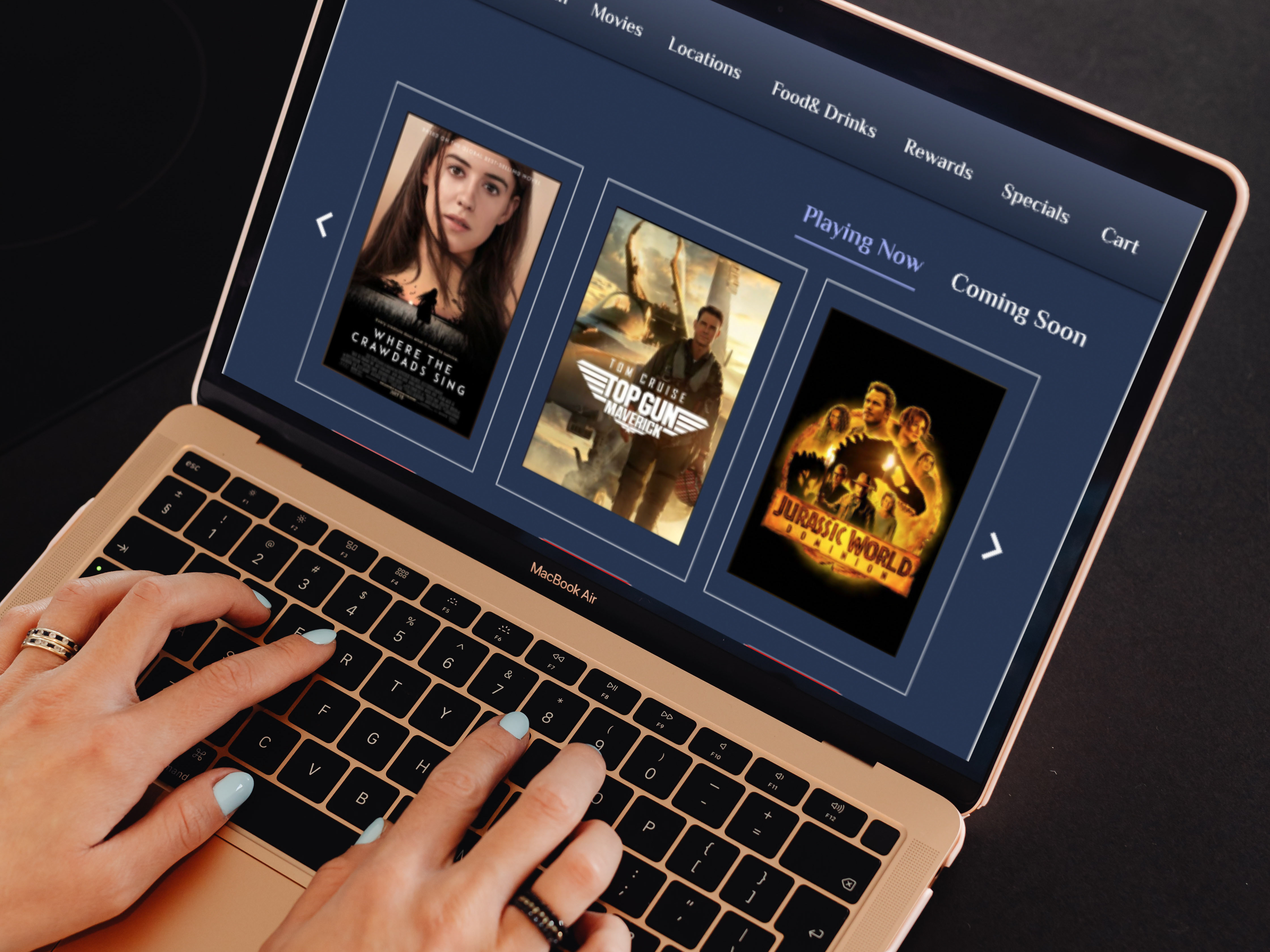
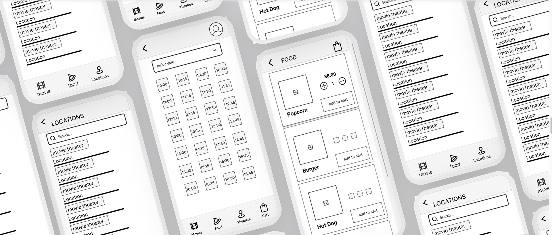
Wireframes
Using Figma, I translated my first sketches into low-fidelity wireframes. At this stage, the wireframes were defined enough for some user testing. Based on 5 usability studies, I’ve made a few alternations and moved on to creating high-fidelity prototypes.

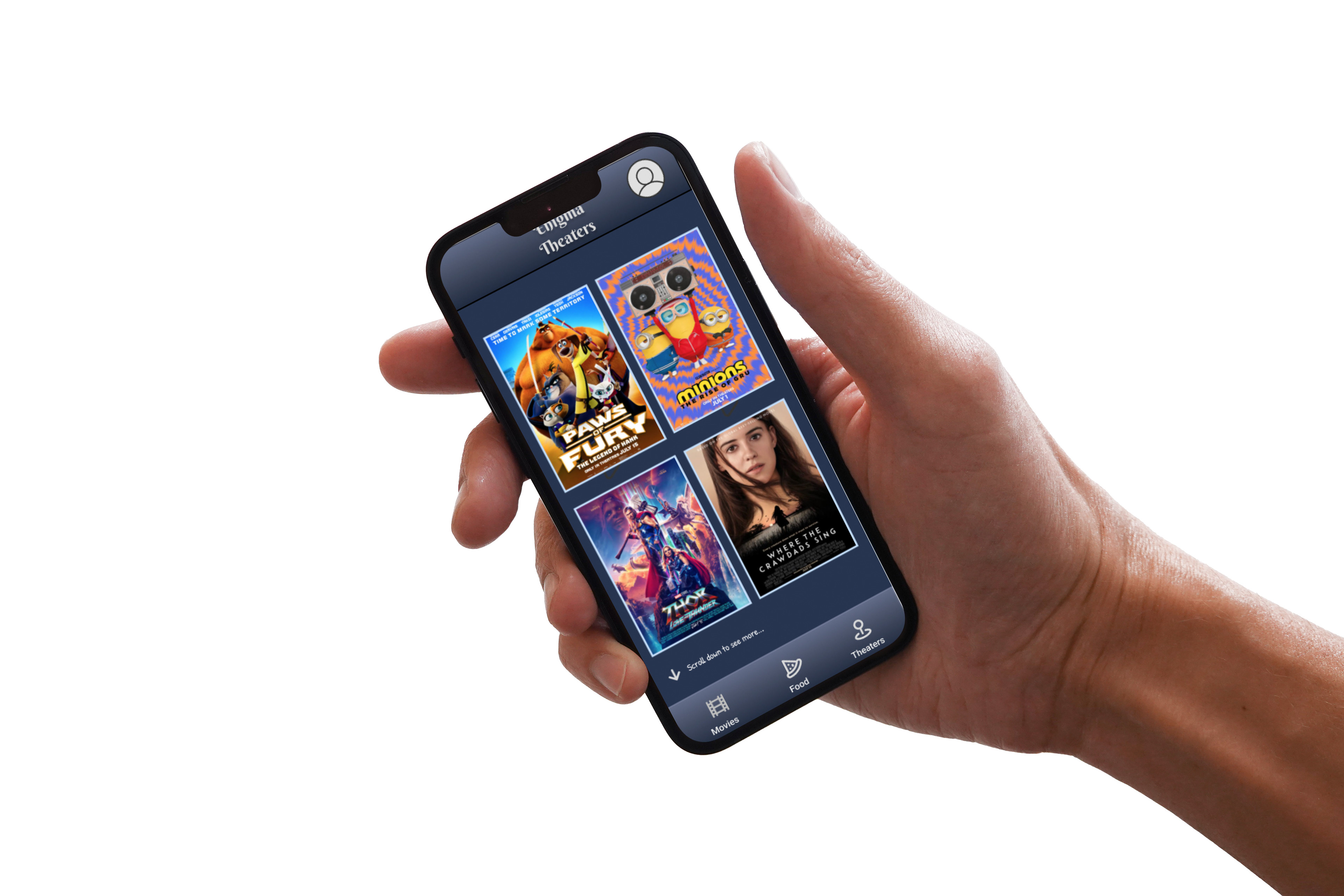
Usability Testing
I created a fully-functional, high-fidelity prototype using Figma. I interviewed 5 users.
Round 1 findings:
*More users could be interested in using Movie Snack App for ordering food if there were incentives.
*Users should be aware which items are available to order.
*Users would like a review page for all the items in their cart before they place their order.
Round 2 findings:
*Users would like to be able to change the location, date and time on the Payment screen, when they review the order.
*Add global menu to every screen
*Add cart to the bottom global menu
*Add a few simple instructions for navigation
*Users found the App pretty straightforward and intuitive.
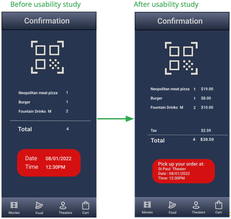
I needed to make sure that the user’s final receipt was reflecting everything they ordered and how much they paid for it, as well as detailed summary where and when they can pick it up.
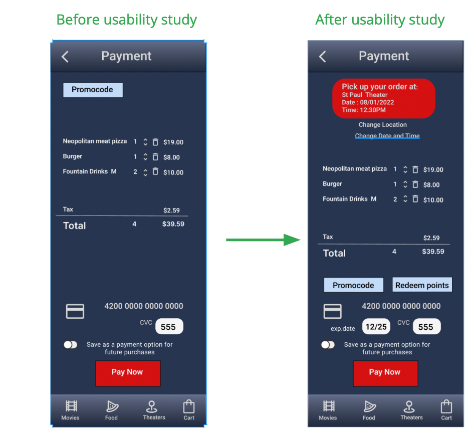
Users would like to see the summary of their order: the movie location, the day and time for the pick-up, and the accessible way to change the theater or time on the same page.
Thank you for reading my case study!
Want to work with me? Feel free to contact me!