THE APP FOR SOCIAL GOOD
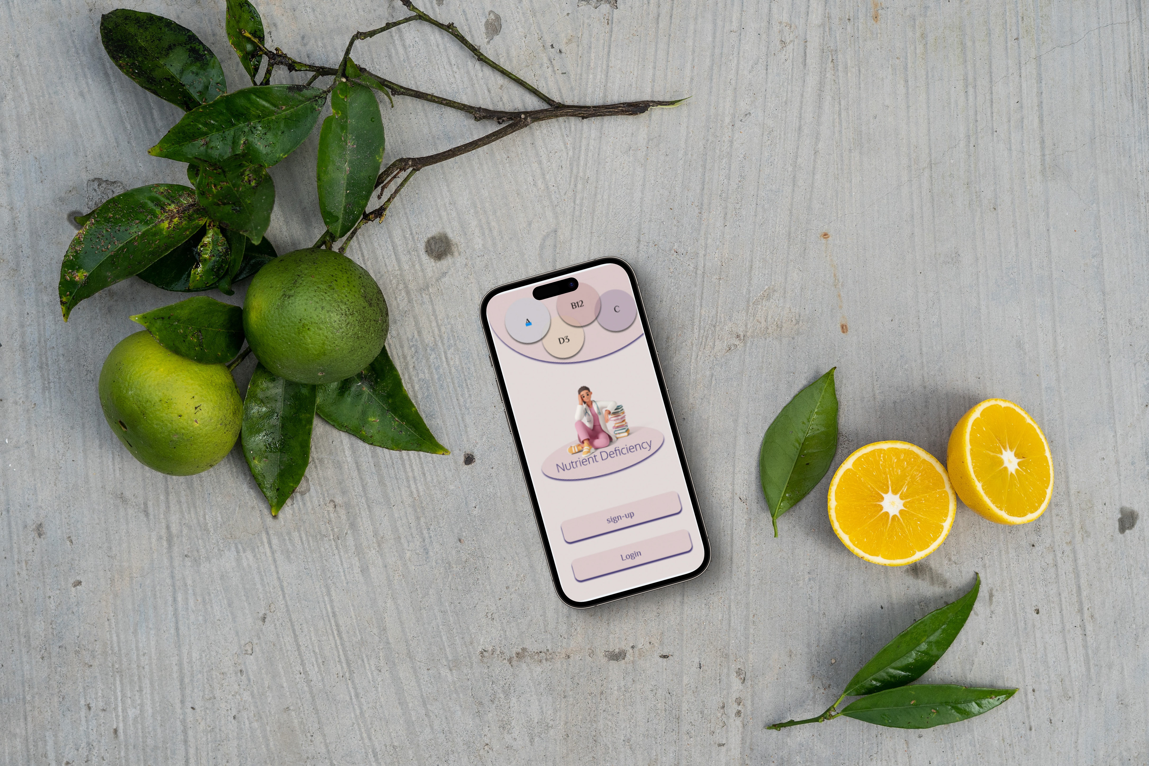
Nutrient Deficiency App was designed to help you figure out what nutrients you might be missing in your diet based on the symptoms you experience. You will be able to find the recommendations for foods, supplements and herbs to fill those deficiencies.
This App was third project for Google UX design.As the sole UX Designer, I was responsible for conducting interviews, paper and digital wireframing, low and high-fidelity prototyping, conducting usability studies, accounting for accessibility, and iterating on designs.
Problem
People who experience symptoms like fatigue, restless legs, migraines, hair loss, etc are looking for answers and very frustrated because they think it’s normal and it’s just it is what it is.
Solution
Help users find nutrient deficiencies based on their symptoms, and then based on that give them foods, supplements and herbs recommendations.
People are very busy and often eat on the go. This App will help them be mindful of what they eat for optimal health and what supplements could help with certain symptoms that could be bothersome for some.
Tools
Figma
Team
1 UX Designer
My Role
UX Designer
UX Researcher
Timeline
Overall: 8 weeks
Discovery & Research: 3+ weeks
Design & testing: 4 weeks
My Design Process
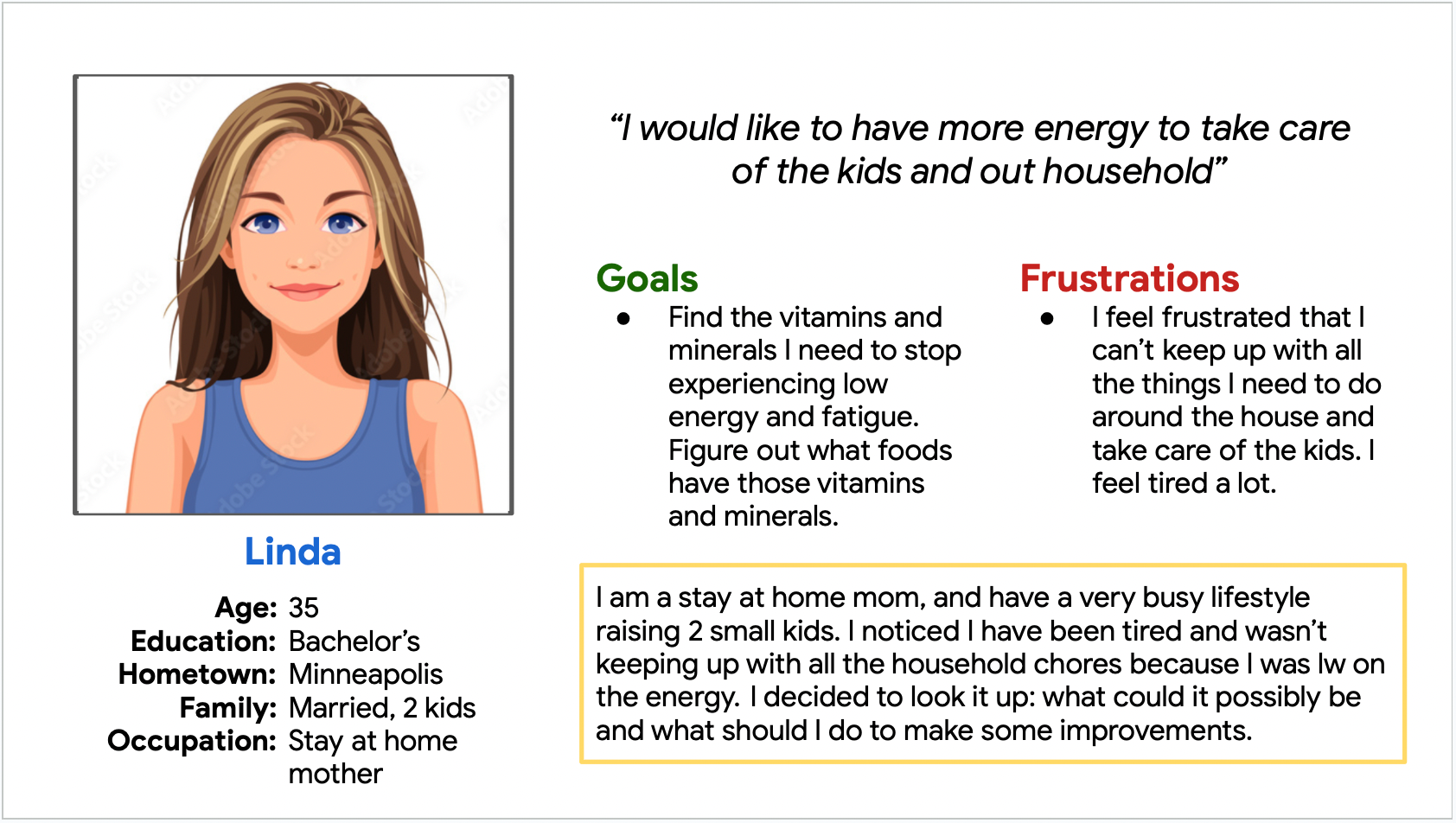
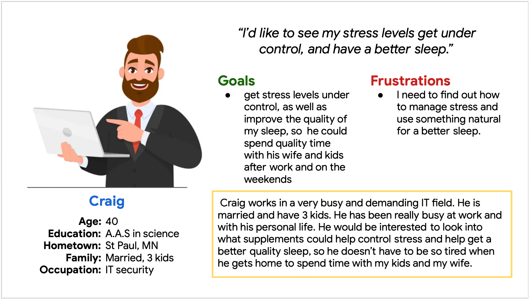
Personas
I wanted to form a deeper understanding of our users' goals, needs, experiences, and behaviors.
So, I created 2 personas for each of user segments. They were based on user interviews and surveys.
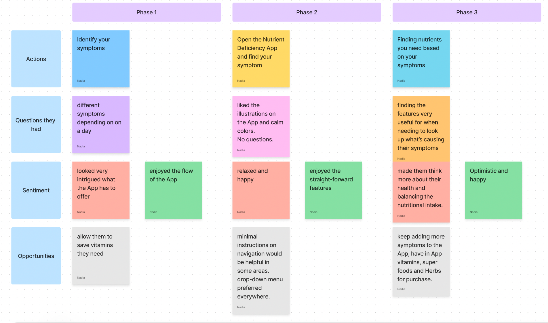
User Journey
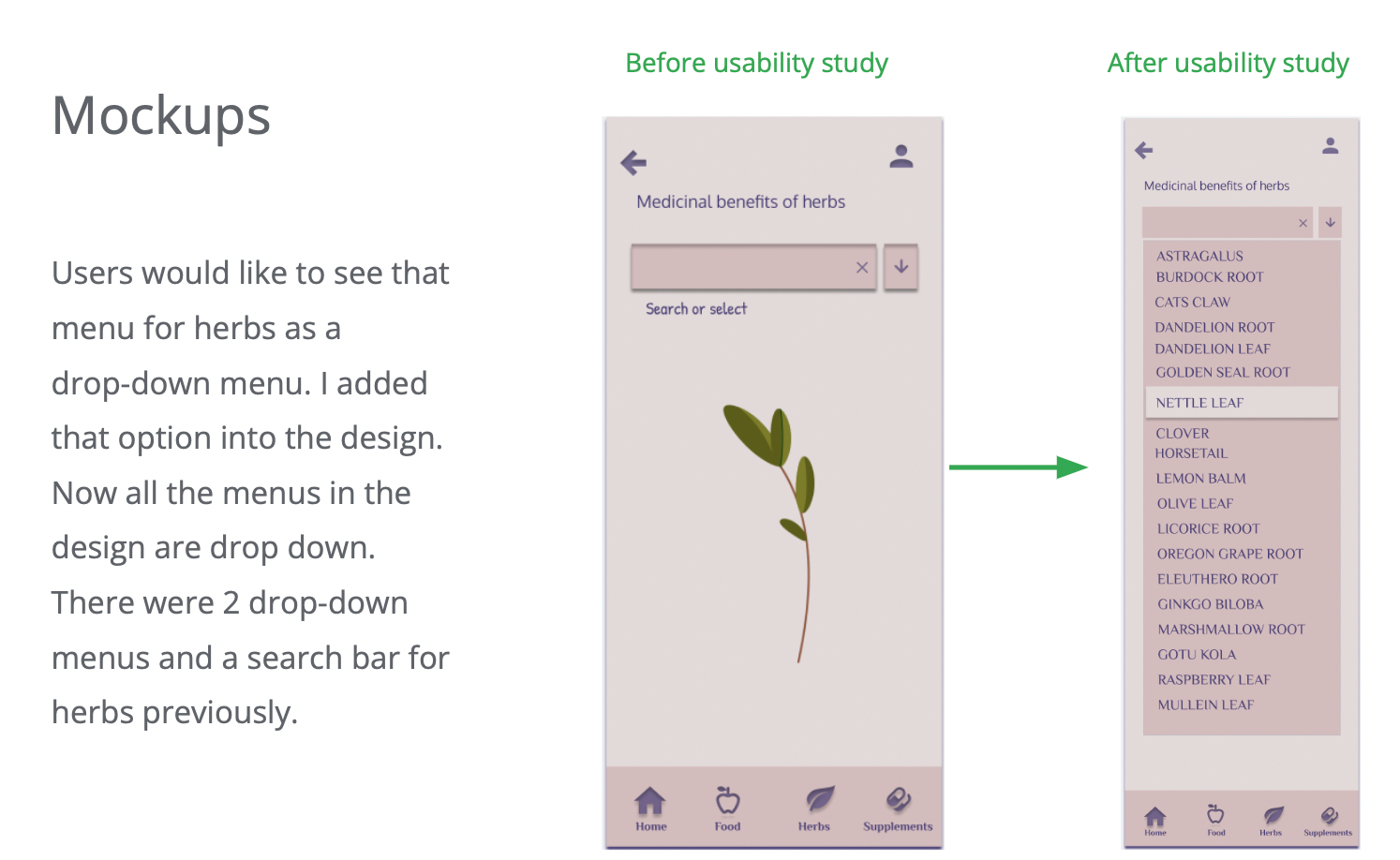
With the user accessibility in mind, I wanted to make sure that users have very intuitive flow and simple design that doesn't overwhelm them. So, I created this user journey map, to identify opportunities for improvement. I was able to identify that a user prefers drop down menus with a choice to select, and minimal instruction labels.
Usability Testing
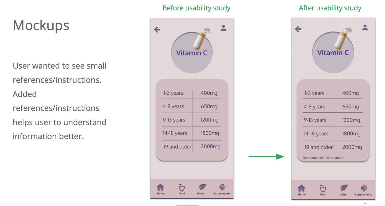
I created a fully-functional, high-fidelity prototype using Figma. I interviewed 5 users.
Findings:
*Some users would like to see more instruction navigating
*A few users would like the titles to stand out more
*A few users would like to see more labels for nutritional info.
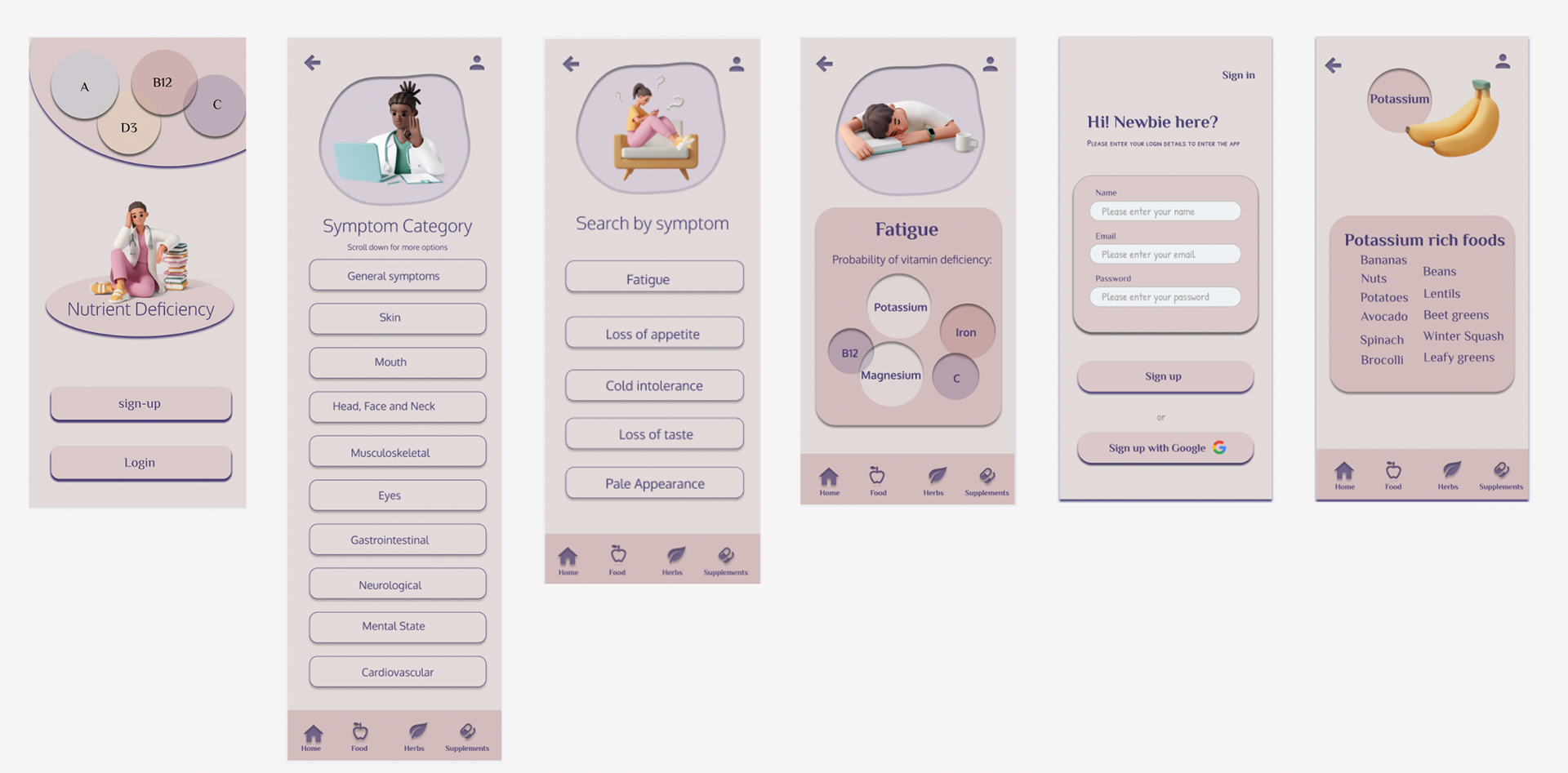
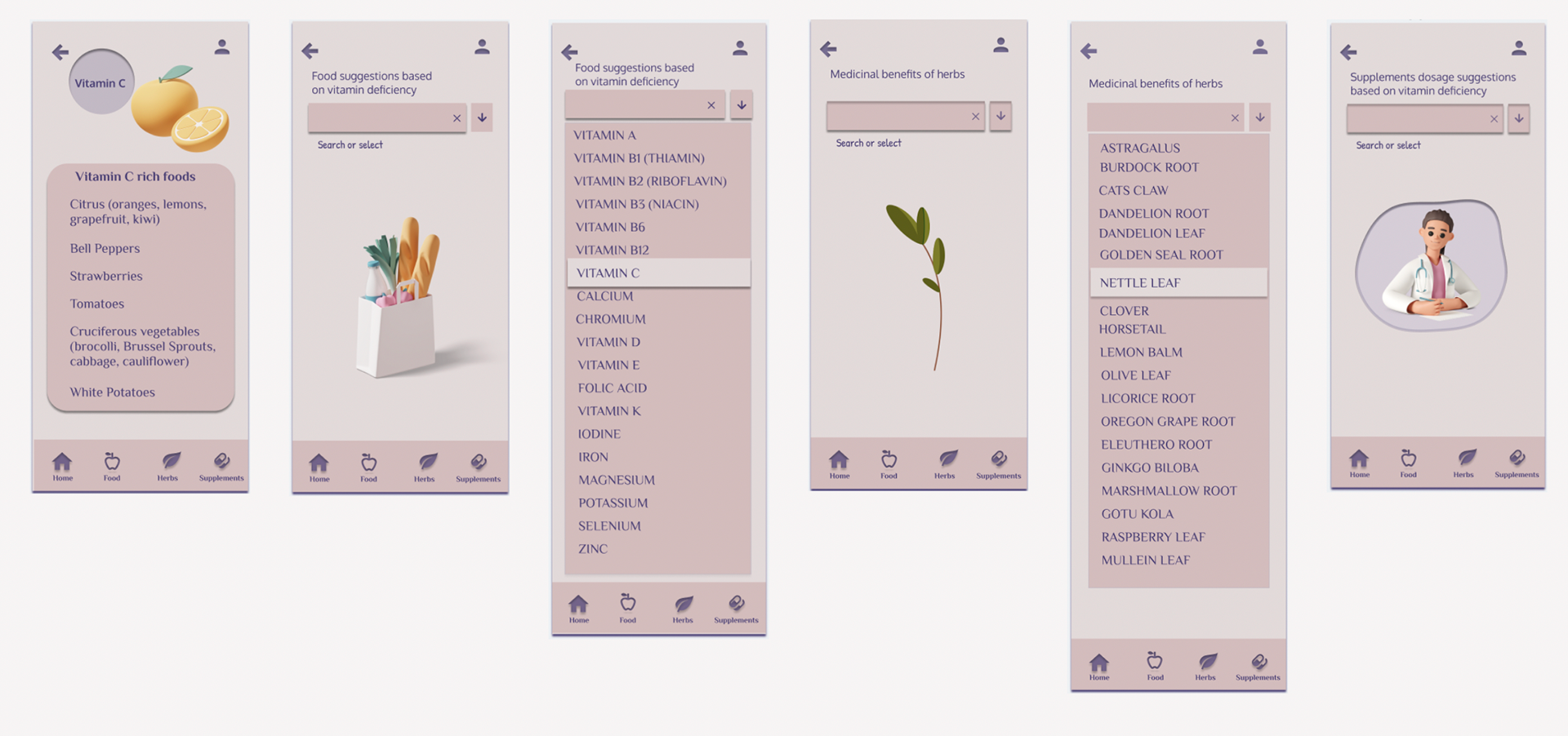
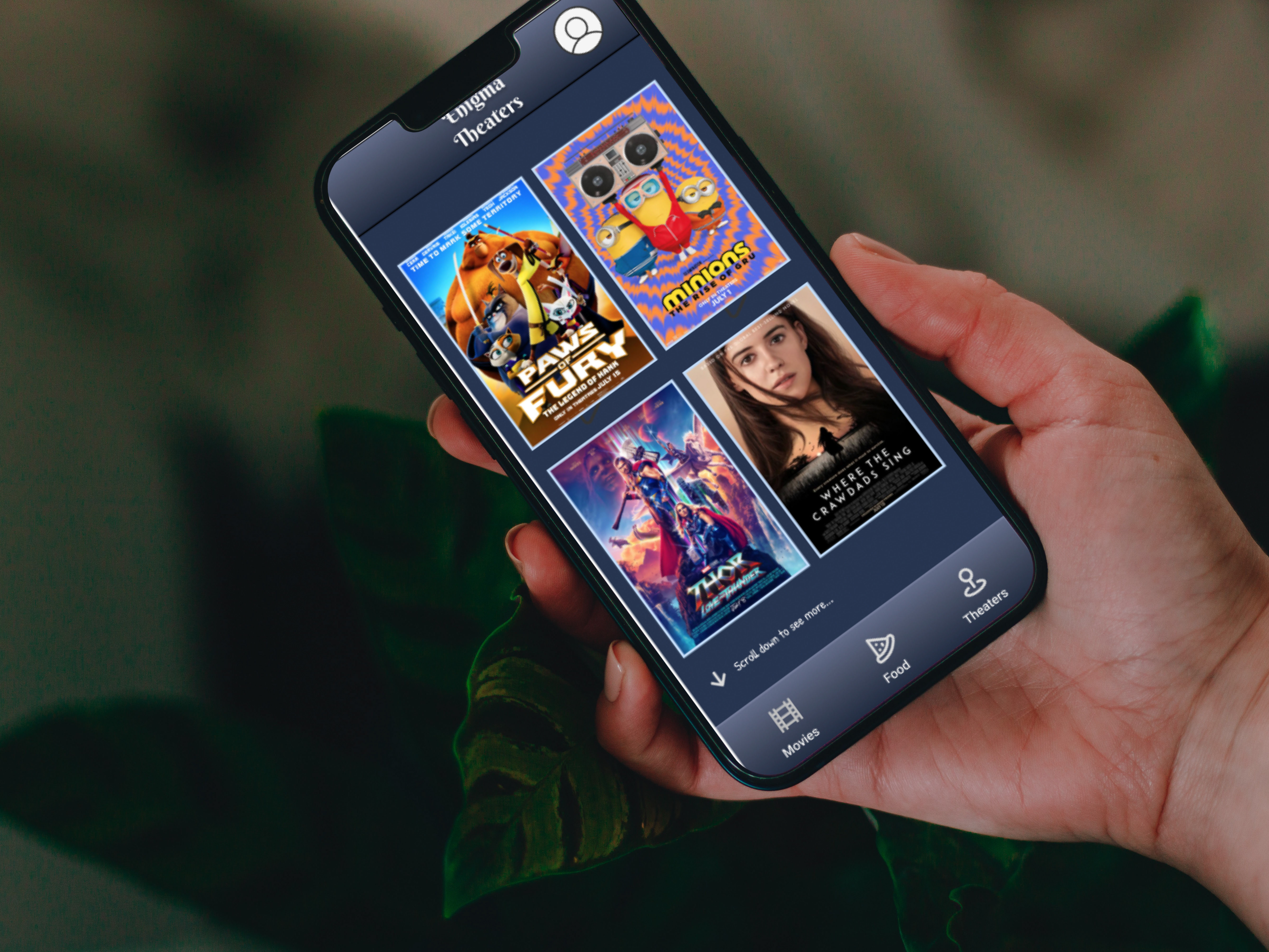
HI-FI MOCKUPS
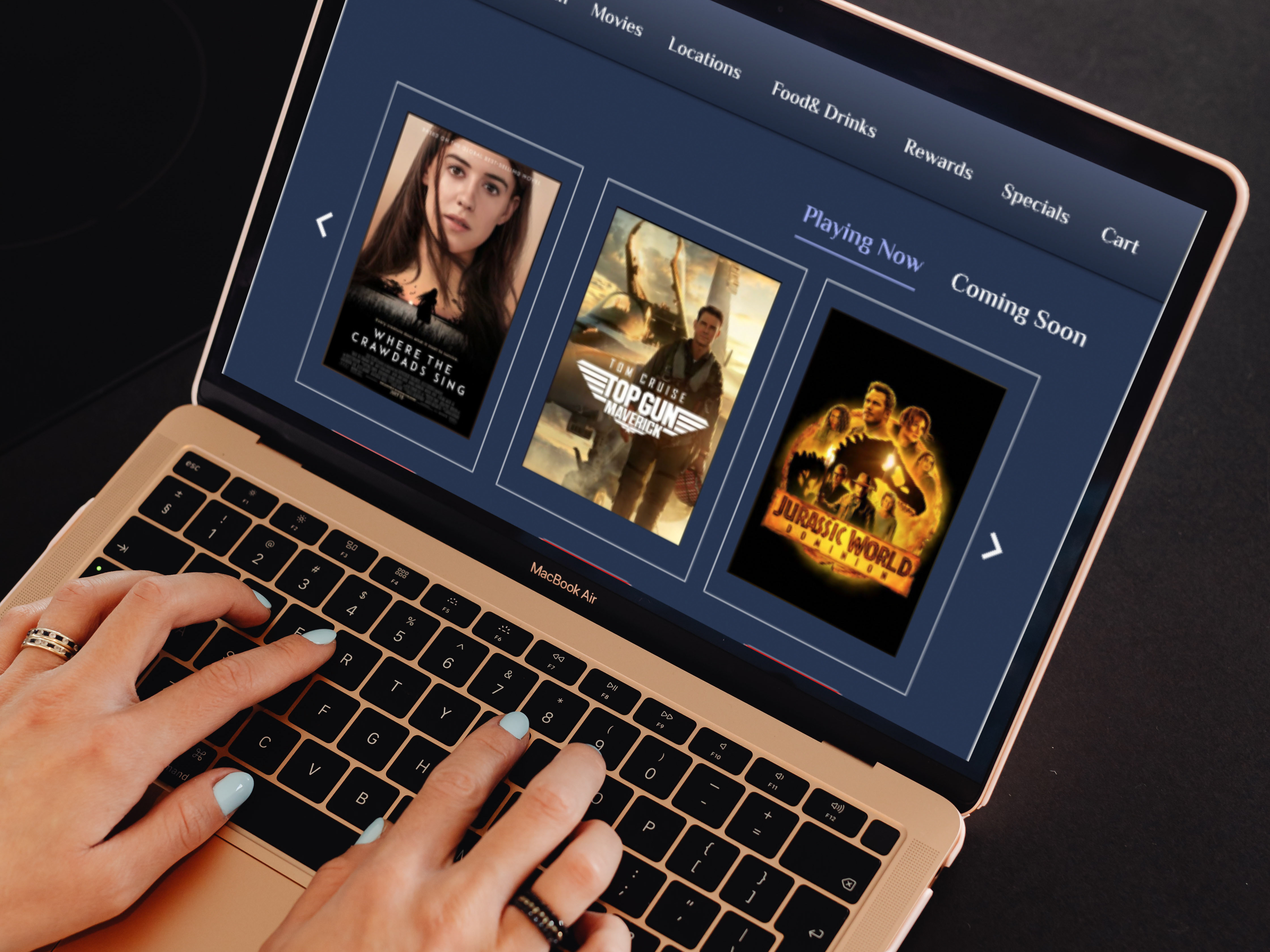
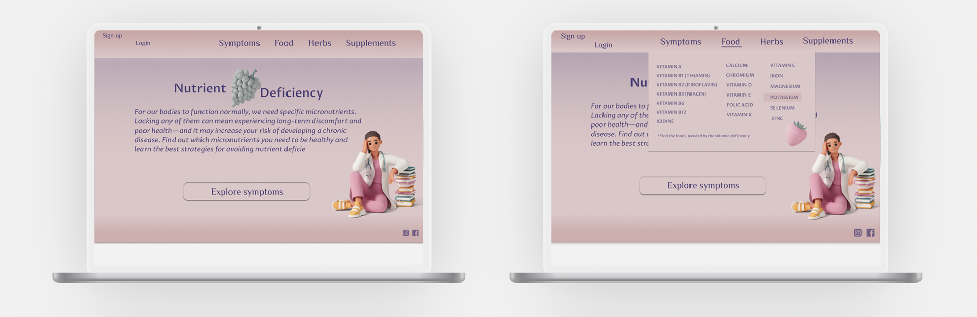
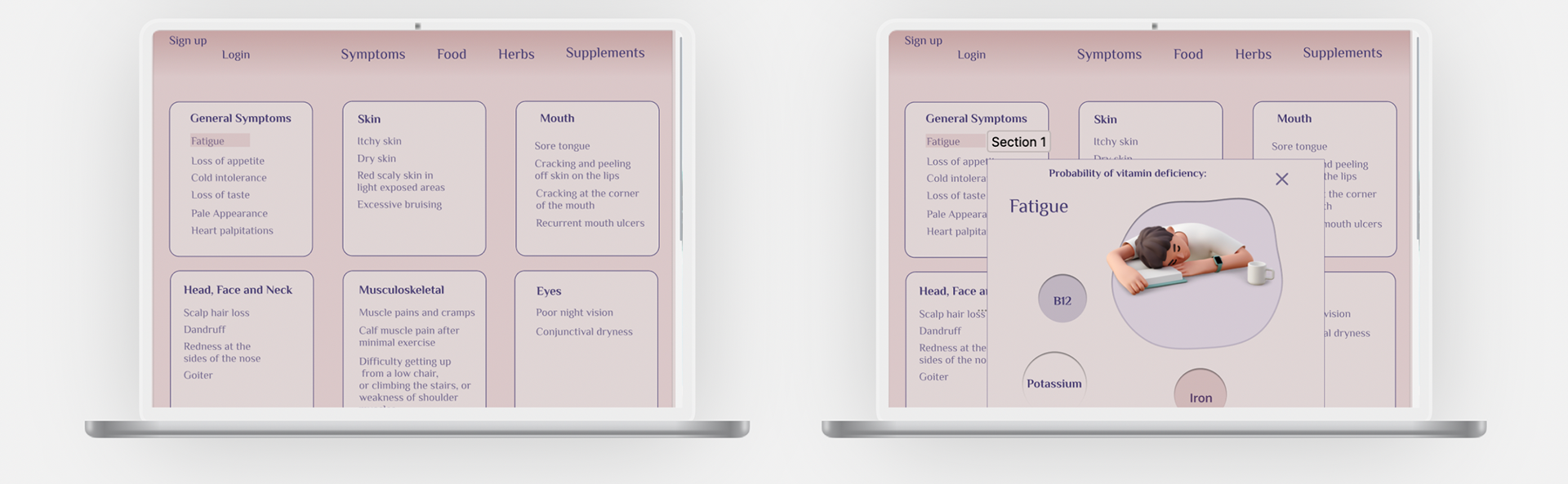
Responsive Web Design
The looks of the website corresponds with the App. Website page allows to display all the symptoms on one page, where as on the App you would have to navigate through a couple pages.
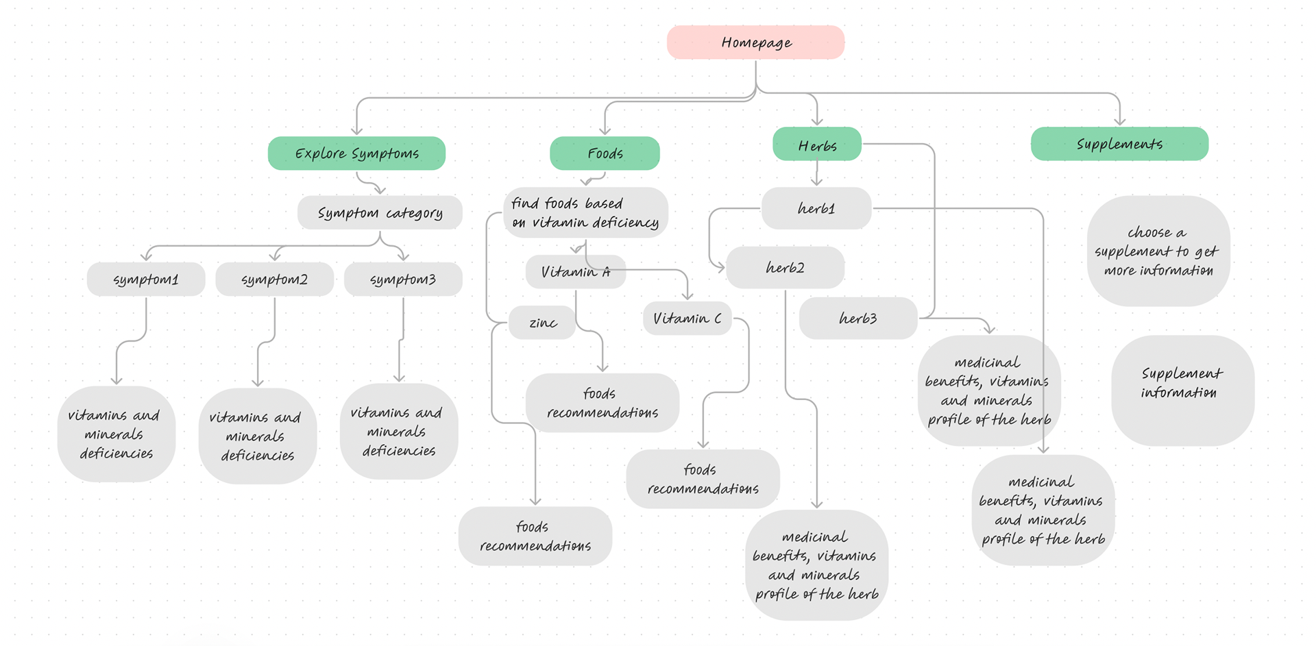
SITEMAP
HI-FI MOCKUPS
Impact
“I like how clean it is visually and its functionality”
“Super delightful transition!”
“I like how clear the info is and it doesn’t feel too overwhelming to read.”
“ The transition feels fluid”
“Calming colors”
Thank you for reading my case study!
Want to work with me? Feel free to contact me!