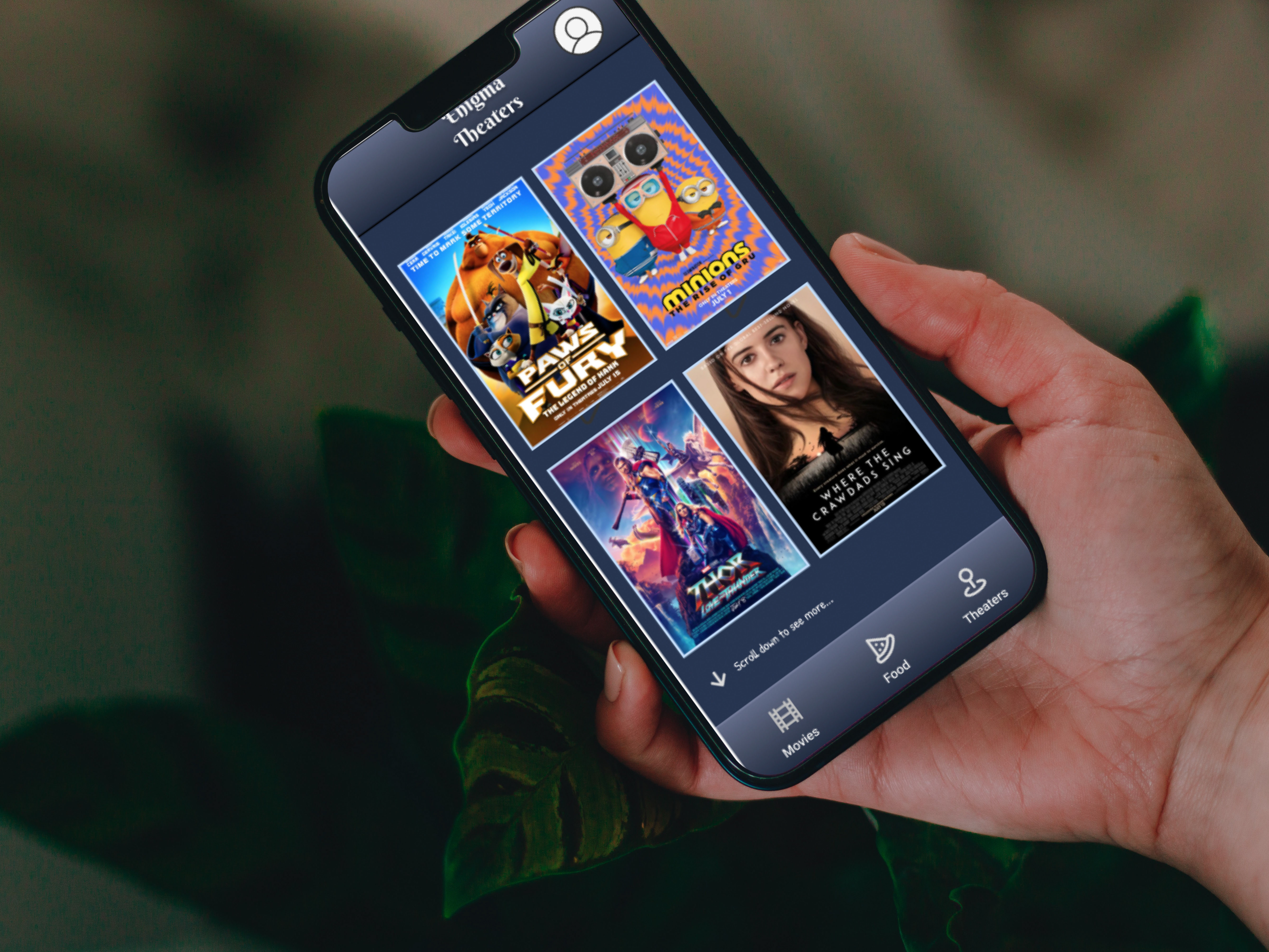
Create a responsive web design for the Movie snack App.
The second project for the Google UX design Certificate was to develop a responsive web design for the app from the first project. As usual, I was wearing many hats in this projects: UX designer, UX researcher. I was pretty happy with the way my design turned out.
Problem
Users needed a way to order snacks for the movies without long waiting lines.
Solution
Create a responsive web design for the Movie snack App that is easy to navigate and have an intuitive flow.
Tools
Figma
Team
1 UX designer
My Role
UX design
UX research
Timeline
Overall: 8+ weeks
Discovery & Research: 2+ weeks
Design & testing: 6 weeks
My Design Process
Personas
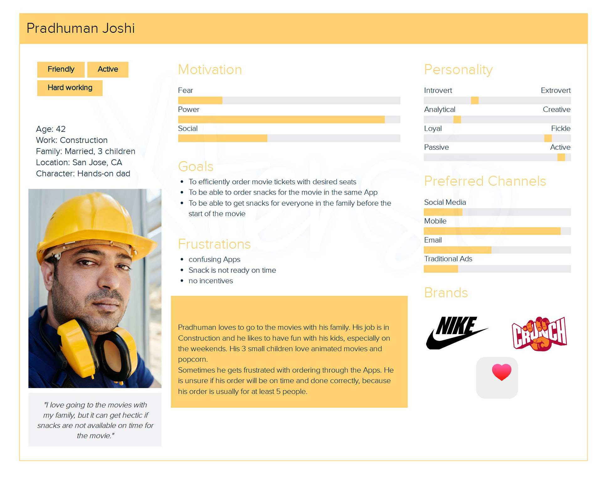
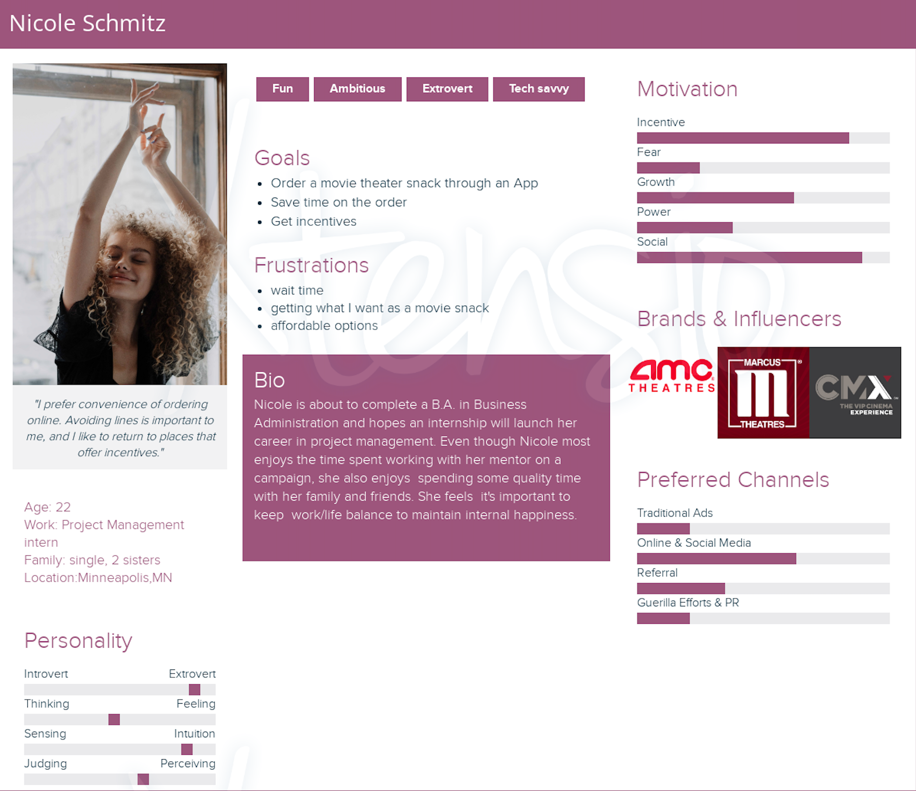
I wanted to form a deeper understanding of our users' goals, needs, experiences, and behaviors. So, I created 2 personas for each of our user segments. They were based on user interviews and surveys
Empathy map
Sitemap
Wireframes
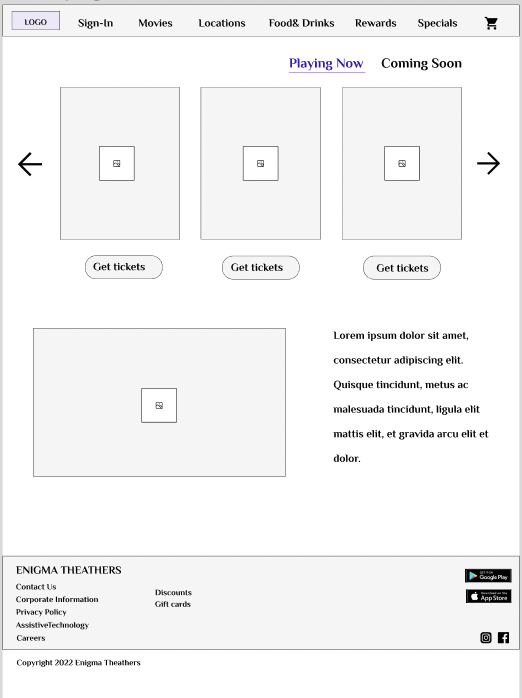
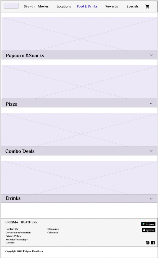
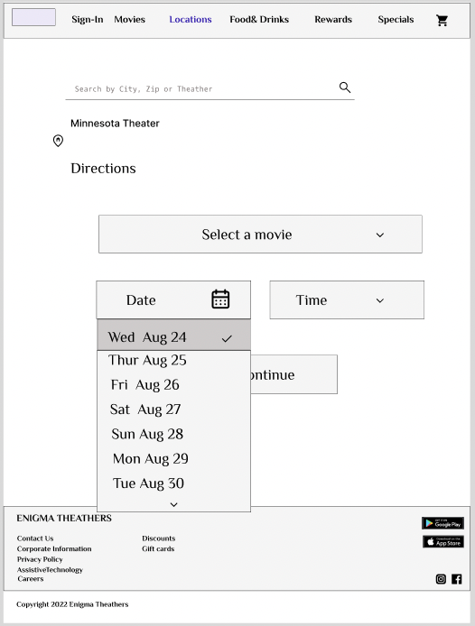
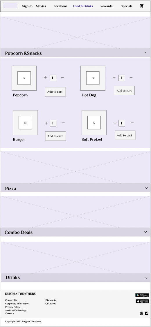
Using Figma, I translated my first sketches into low-fidelity wireframes. . At this stage, the wireframes were defined enough for some user testing. Based on usability study, everything was working intuitively, because the needs and wants of the users was provided from the App version of this responsive website.
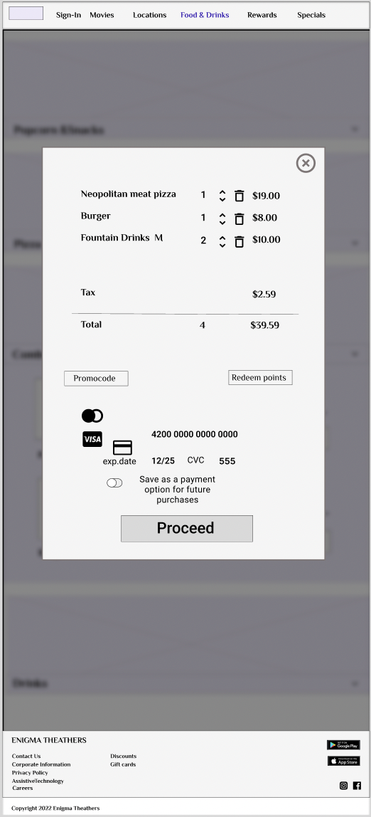
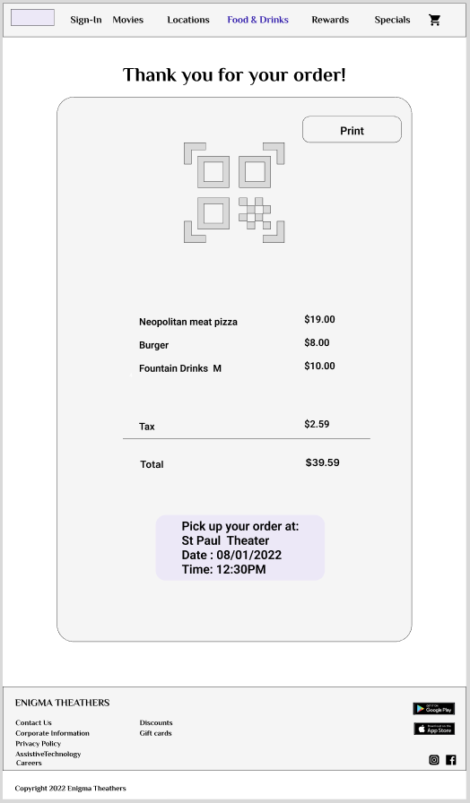
Hi Fidelity Mockups
I made sure the design of the website was corresponding with the App, as well made sure that it's accessible and easy to navigate.
Hi-fi Prototype
Thank you for reading my case study!
Want to work with me? Feel free to contact me!
